How to Build a Mobile-First Website: A Complete Guide to Success
Is your website built for the mobile world? In this article, we explain why Mobile-First Website Design matters more than ever and how it impacts your SEO, user experience, and bottom line. Discover practical tips to keep your site fast, functional, and mobile-friendly.

Written by Michael Mitov
Last updated March 28, 2025 • First published December 31, 2024

Why Mobile-First Website Design Matters More Than Ever
Creating a mobile-first website design is no longer just a trend—it’s a necessity. With more than half of all web traffic now coming from mobile devices, your site needs to be optimized for these users first and foremost. If it’s not, your rankings, user experience, and overall success could suffer dramatically.
Think about it. You’re browsing a website on your phone, and the text is too small to read, the images are misaligned, and it takes forever to load. Frustrating, right? Now imagine that this is happening to your site’s visitors. Not only will they leave your site, but they’ll likely turn to your competitors.
Google’s Mobile-First Indexing, which prioritizes mobile site content for ranking, has cemented mobile optimization as a critical factor for SEO. If your mobile experience isn’t up to par, your rankings will drop, and with them, your potential for growth.
In this guide, our 1st on the List SEO Experts will walk you through the essential steps to create a mobile-first website design that both users and Google will love.

Key Insights into Mobile-First Web Design
- Mobile Traffic is King – More than 50% of all internet traffic now comes from mobile devices, making a mobile-friendly web design crucial for reaching your audience.
- Google’s Mobile-First Indexing – Google prioritizes the mobile version of your website for ranking purposes, meaning poor mobile optimization can severely impact your SEO.
- Speed & Simplicity Matter – The best mobile-first websites are fast, intuitive, and minimalistic to keep users engaged.
- Optimize for Speed – Compress images and use lazy loading to improve performance.
- Continuous Testing and Refining – Regularly test and optimize your mobile site to ensure it meets current performance standards.
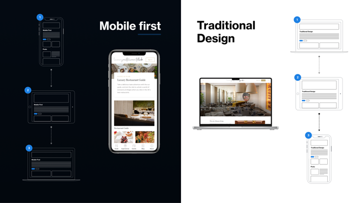
What is Mobile-First Design?
Mobile-first website design means you start by designing and developing your website with mobile devices in mind. You can then scale up for larger screens like tablets and desktops. Along with having a great website structure, a mobile-first approach ensures that mobile users—who make up the majority of web traffic—get a fast, functional, and user-friendly experience right from the start.
LIKE WHAT YOU’RE READING?
If these articles are helpful,
imagine what our team
can do for you!
Let’s identify the quick wins you can easily apply to your website.


Not Sure What Your Website Needs Anymore?
Search has changed. AI tools are influencing visibility. Let’s clarify what actually matters for your business now.
Not Sure What Your Website Needs Anymore?
Search has changed. AI tools are influencing visibility. Let’s clarify what actually matters for your business now.
Luke Wroblewski, a pioneer of mobile-first thinking, explains it well: “Mobile forces you to focus. There’s no room for extraneous UI elements, you can’t hide behind hover, and everything needs to be touch-friendly.”
Rather than trying to squeeze a desktop layout into a small screen, a mobile-first website design leads to a cleaner, more efficient website.
Why You Need to Prioritize Mobile-First Website Design
With mobile users dominating the web, failing to optimize your website for mobile devices is like closing your shop when your customers arrive. The vast majority of your audience is on mobile, whether they’re browsing, shopping, or engaging with content. If your website doesn’t work on their mobile devices, they won’t hesitate to move on to a competitor.
Moreover, Google’s mobile-first indexing means that Google uses your mobile site to determine search rankings. A poorly optimized mobile site can significantly impact your SEO performance, ultimately reducing organic traffic.
Let’s not forget the user experience. Mobile-first website design is about speed and simplicity. Mobile users expect pages to load quickly, and if your site doesn’t meet these expectations, they’ll bounce in frustration.
How to Build a Mobile-First Website: A Step-by-Step Guide
Designing a website for mobile devices is not just about shrinking down a desktop design—it requires a complete shift in mindset. Here’s how you can build a mobile-first website design that stands out in today’s mobile-driven world.
1. Start with a Responsive Website Layout
The foundation of mobile-first design is responsiveness. A responsive web design website automatically adjusts to the size and resolution of the user’s device, ensuring it looks great on any screen. Whether someone visits your site on a phone, tablet, or desktop, a responsive layout guarantees a seamless experience.
To achieve this, use Fluid Grids (rather than fixed-width layouts), flexible images, and CSS media queries to adapt the content based on the device’s dimensions. Tools like Bootstrap can make responsive design much easier to implement.
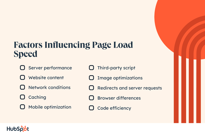
2. Speed Is Essential
Speed is critical in mobile-first website development—especially since mobile users often have slower internet connections. If your website takes longer than a few seconds to load, you’ll lose visitors.
To optimize your mobile-first website for speed:
- Minimize HTTP requests by combining CSS and JavaScript files.
- Use Content Delivery Networks (CDNs) like Cloudflare to deliver content faster by storing it on servers closer to your users.
- Compress images with tools like TinyPNG or ImageOptim.
- Leverage browser caching to store assets on users’ devices, reducing load times on repeat visits.
Use Google PageSpeed Insights to analyze your site’s performance and get tailored suggestions for improvement.
3. Simplify Navigation
On mobile, simplicity is key so provide a good navigation structure. Avoid overwhelming users with too many options, especially given the limited space on mobile screens. Use a hamburger menu to hide the navigation bar and keep the interface clean. However, don’t clutter the menu with too many options—keep it minimal and intuitive. It’s a good idea to also anchor the navigation menu so that it stays visible when people scroll down the page.
Also, ensure that touch targets (buttons and links) are large enough for users to tap without frustration and are ADA-compliant. Research from mobile interface expert Josh Clark reminds us that every pixel counts on mobile screens, so prioritize ease of use.
4. Optimize Images for Performance
Large, unoptimized images are one of the leading causes of slow loading times on mobile devices. Optimizing images as part of your mobile-first website design will help reduce their size without having to sacrifice quality.
- Try using current image formats like WebP, which offers superior compression compared to JPEG and PNG.
- Implement lazy loading, which ensures that images only load when they’re visible to the user, reducing initial page load time.
Tools like TinyPNG and ImageOptim can help compress images for the web. Additionally, ensure that image sizes match the display sizes they’ll be shown on to prevent unnecessary data usage.
5. Future-Proof with Voice Search & AMP
As voice search becomes more prevalent with assistants like Siri, Alexa, and Google Assistant, optimizing your content for voice queries is crucial. Voice search queries tend to be more conversational, so ensure your content is optimized for long-tail keywords and natural language.
Consider implementing AMP (Accelerated Mobile Pages) for faster content delivery. AMP pages load almost instantly and are often featured in Google’s Top Stories carousel, providing a boost to your visibility.
6. Continuous Testing & Optimization
Building a mobile-first website design is an ongoing process so always design your website with SEO in mind. The digital landscape evolves constantly, and so should your site. Regular testing and web optimization are essential to maintaining optimal performance.
- Use GTmetrix or Google Lighthouse to continuously assess your website’s performance.
- Perform A/B testing to compare different designs or layouts and determine what works best for your users.
- Gather user feedback regularly to identify pain points and areas for improvement.
Contact 1st on the List for Help with Mobile-First Design
Creating a mobile-first website design isn’t just about adapting a desktop design to fit a smaller screen. It’s about creating an experience tailored to the needs of mobile users from the ground up.
At 1st on the List, our Website Design Experts can help by focusing on speed, simplicity, and ease of navigation. We can build you a mobile website that not only performs well but thrives in the mobile-driven digital landscape.
Remember, designing for mobile is about delivering the best experience possible, regardless of device. Now, let’s get started on your mobile-first journey—and watch your website soar!
To learn more please call us toll-free at 1-888-262-6687 or contact us online.
Frequently Asked Questions (FAQs)
Michael Mitov
Michael Mitov is a Website Developer and SEO Project Manager at the 1st on the List head office in Abbotsford. With over 18 years of experience in his field Michael specializes in WordPress Development, Local Search, and Lead Pages and Sales Funnels. When not launching new websites and achieving visibility for his clients Michael is busy staying on top of SEO and marketing trends or biking and hiking in the beautiful British Columbia.
![A promotional graphic with the text "Is Your SEO Still Working in 2026?" and a blue button labeled "Book a Discovery Call." Below, it says "[No hassle, no pressure, just 30 minutes of insights]." The background has abstract blue shapes.](https://www.1stonthelist.ca/wp-content/uploads/2024/09/blog-sidebar-cta-2-1.png)
Don’t miss out – get newest posts straight to your inbox!
OTHER ARTICLES WE THINK YOU’LL ENJOY


Partner With Us. Get More Leads.
Stop trying to do it all on your own – reach out to our team and we can discuss marketing strategies that are best suited for your business!
“Your expertise has been a tremendous asset to our company … in the last 6 months of 2024, we had larger average job size, qualified leads and some we didn’t need to bid and compete for.”

“We have seen a steady increase in web traffic and quality leads since first working with 1st on the List. And we continue to see monthly increases through their efforts.”

“They have helped my firm grow organic web traffic month over month and their ongoing support and guidance is something you don’t typically receive from other established competitors.
[NO HASSLE, NO PRESSURE, NO WORRIES – JUST MEANINGFUL INSIGHTS]